Have you tried plotting in Obsidian?
Unfortunately, it can be challenging and technical.
But not today! If you want a way to track task completions over time, then look no further.
This is the easiest method I’ve found for task plotting in Obsidian, and it looks like this:

Creating graphs is one of my favorite tricks in Obsidian, and I use data visualization every day in my own vault.
I wrote about this before now, but that article was intended for inspiration and not instruction. I asked readers to let me know if they want more details, and I received many requests for specific instructions.
You want instructions? Well here they are!
Prerequisites
In order to create graphs in your own vault, there are a couple of community plugins that you need to install. If you haven’t already, search for and install these two plugins in your vault (click the links to open in Obsidian):
Then check your Dataview settings and make sure that “Enable JavaScript Queries” is ON. We’ll need that soon.
This solution depends on tasks completed in the style of the Tasks plugin. That means your tasks each have to have a completion date attached to them, preceded by a checkmark emoji (✅). The Tasks plugin isn’t mandatory, but it makes formatting tasks easy.
Note: If you haven’t used community plugins before, you might want to read How to use Community Plugins and a Beginner’s Guide to Dataview.
Plotting in Obsidian by using a script
Plotting in Obsidian can be complicated. That’s why, for the purposes of this article, I have created a simple script that anyone can use. Even if you know nothing about code, you can use this script.
You can see the script here. Download the file and place it somewhere within your vault.
Once you have the JS file included in your vault, copy this text and paste it into a new note in your vault (I call this note “Tasks Completed” but you can name it whatever you like):
---
days: 30
months: 6
years: 3
projectfolder:
lineColor: '#de454e'
---
```dataviewjs
await dv.view("tasks-dashboard", {container: this.container});
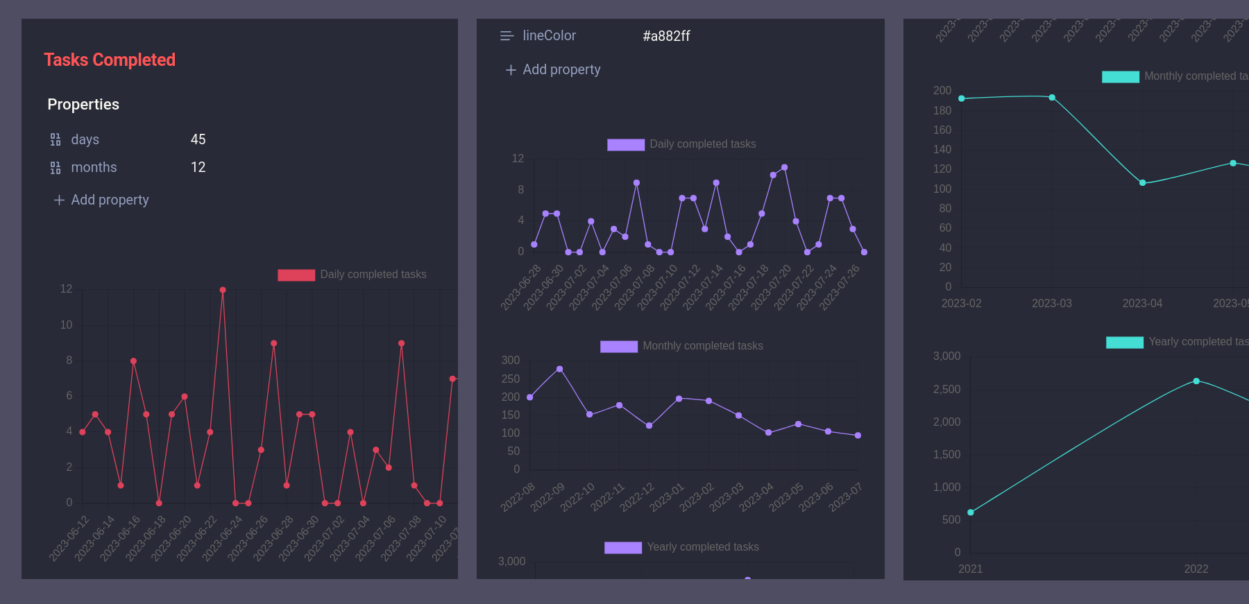
```If everything is configured properly, you should see something like this:

How does the script work?
The Tasks Dashboard script relies on a few custom properties within your note. These custom properties allow you to change how the script operates.
Note: If Properties are new to you, check out our An Introduction to Obsidian Properties and Five Pro Tips for Obsidian Properties.
In the note you just created, the custom properties are all at the top of your file. They are:
days: change how many days the graph displaysmonths: change how many months the graph displaysyears: change how many years the graph displaysprojectfolder: By default this script searches your whole vault for tasks. Project folder allows you to limit the search to a specific folder or tag. If you want to limit the script to a folder, add the path to the folder in quotes, e.g. “path/to/folder”lineColor: This allows you to change the color of your graph. Any hexadecimal color will work here, or you can leave it as the default.
Feel free to change the above properties to fine-tune your graph. I typically like having 30 days, 6 months, and 3 years for my dashboards, but you may find other ranges that work better for you.
You can also remove any of the date properties and the appropriate graph will disappear. So if you don’t have years of data, or you don’t find that metric useful, feel free to remove the years property and the graph will disappear.
Conclusion
If you manage tasks in Obsidian, I hope you’ll give this script a try. I’d love to hear if it works for you!
If you do use tasks but this script doesn’t work for you, feel free to reach out and let me know. If there’s a common use-case that this script doesn’t cover, I’d love to hear about it.
Leave a Reply